Which accessibility settings should you turn on? Subtitles, colour and controls explained
Most games hide their best comfort settings in the menus. This guide shows what subtitle size, a dark background box and speaker names do to readability, with a live contrast reading, and why teams should never be told apart by colour alone.
Try the colour-vision views and shape markers yourself, then use the two-minute checklist to set up subtitles, colour, controls and volume in any new game.
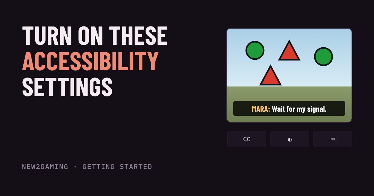
Before you play a new game, spend two minutes in its menus. The accessibility or display options often decide whether you can read the story, spot the enemy and hold the controller comfortably. They are not only for players with a disability: a small, low-contrast subtitle is hard to read on anyone's sofa.
Subtitles: size, background and who is talking
Subtitles fail in three ways: the text is too small, it blends into the scene, or you cannot tell who is speaking. The Game Accessibility SIG of the IGDA recommends a readable default size, short lines (it suggests no more than about 38 characters), a dark box behind light text, and a label showing the speaker. Many games bury these switches in an Audio or Accessibility menu, and some turn subtitles off by default.
Contrast is the number to know. Web accessibility rules (WCAG) ask for at least 4.5:1 between normal-sized text and what is behind it. White text over a bright sky is nowhere near that. A semi-transparent dark box fixes it, whatever the scene does.
Colour: never rely on colour alone
Roughly 1 in 12 men and 1 in 200 women have some form of colour vision deficiency, most often affecting red and green (figures from Colour Blind Awareness). If a game shows friends in green and enemies in red and nothing else, those players can find the two hard to separate. Good games add a second signal: a shape, an icon or a pattern. Many also offer a colour-blind mode in the display settings that shifts the palette.
Controls: remap, toggle and tune
Three control options help almost everyone. Remapping lets you move an action to a button your hand can reach, for example jump on a shoulder button so your thumb stays on the stick. Hold vs toggle turns "hold to aim" or "hold to sprint" into a press-on, press-off switch, which saves your grip during long sessions. Sensitivity and inversion settings let you adjust how fast the camera moves and whether pushing up looks up or down. If you are new, play ten minutes first, then change one thing at a time.
Other settings worth a look
Separate volume sliders for music, effects and dialogue help when voices get lost under explosions. A high-contrast or enlarged-text option makes menus readable on a far-away TV. Screen shake and camera motion sliders, where they exist, are the comfort switches for people who get queasy. Difficulty and assist options are accessibility settings too: using them is not cheating, it is choosing the way you want to play.
Your two-minute checklist
Open the menus in your first session and go through these in order: subtitles on, size up and a dark background if offered; speaker names on; a colour-blind mode if team or item colours confuse you; controls remapped or set to toggle if anything feels awkward; separate volume levels for dialogue. Settings are saved per game, so it is worth doing once for each new title. If a game hides the options, check the console or platform settings too, as some offer system-wide captions and text size.
More in Getting Started
all Getting Started →31 Oct Should you turn off motion blur and film grain? Post-processing effects explained Games add a last layer of effects after the picture is drawn: motion blur, film grain, chromatic aberration, depth of field, vignette and… Getting Started
29 Oct What is anti-aliasing? Jaggies, FXAA, MSAA and TAA explained Ever noticed little stair steps on a diagonal line or the edge of a round object in a game? Those are jaggies, and anti-aliasing is the… Getting Started
27 Oct Will a game run on your PC? Minimum vs recommended requirements explained Every game store page has a Minimum and a Recommended box full of part names. Here is what each column actually promises, which of the five… Getting Started
25 Oct Why does a game stutter when the FPS looks fine? Frame time and 1% lows explained Your game says 60 FPS but feels choppy. That is not in your head: FPS is an average, and it hides how evenly the frames arrive. Learn what… Getting Started
23 Oct What is V-Sync? Screen tearing, G-Sync and FreeSync explained Why does your game screen sometimes show a torn line, and what do V-Sync, G-Sync and FreeSync do about it? This guide explains how your… Getting Started
20 Oct What is HDR in games? Nits, DisplayHDR and when to turn it on HDR promises brighter highlights and deeper shadows, but only if your screen, your system and your game agree. This guide explains what HDR…